Home Decor
14 GALLERY WALL LAYOUTS TO GET YOU STARTED

GALLERY WALL LAYOUTS: THE BASELINE
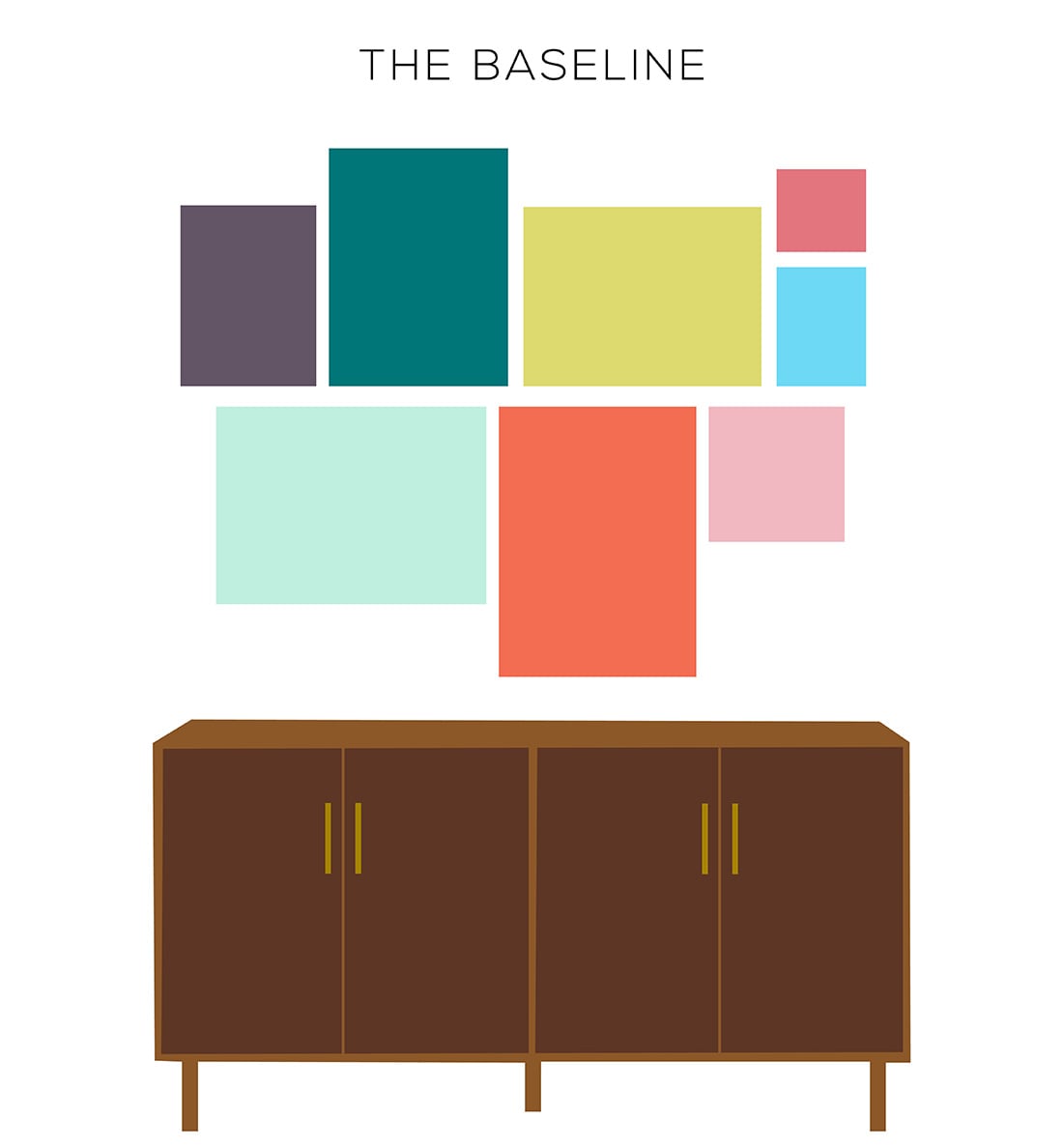
Remember when you were a kid and you would practice drawing your letters starting at the baseline? This is kinda like that.
You’re going to tape off a straight line, then hang art atop and below the line. The art on top is like your ascenders (f, h, l) and the art on the bottom is your descenders (j, g, p).
This division makes your gallery wall look organized, even with different frames or sizes.
Works best with: variety of art, variety of frames, mismatched art, a growing gallery wall (you can keep adding to this).
Try it in the: living room, over the sofa, hallway
GALLERY WALL LAYOUTS: THE BOX
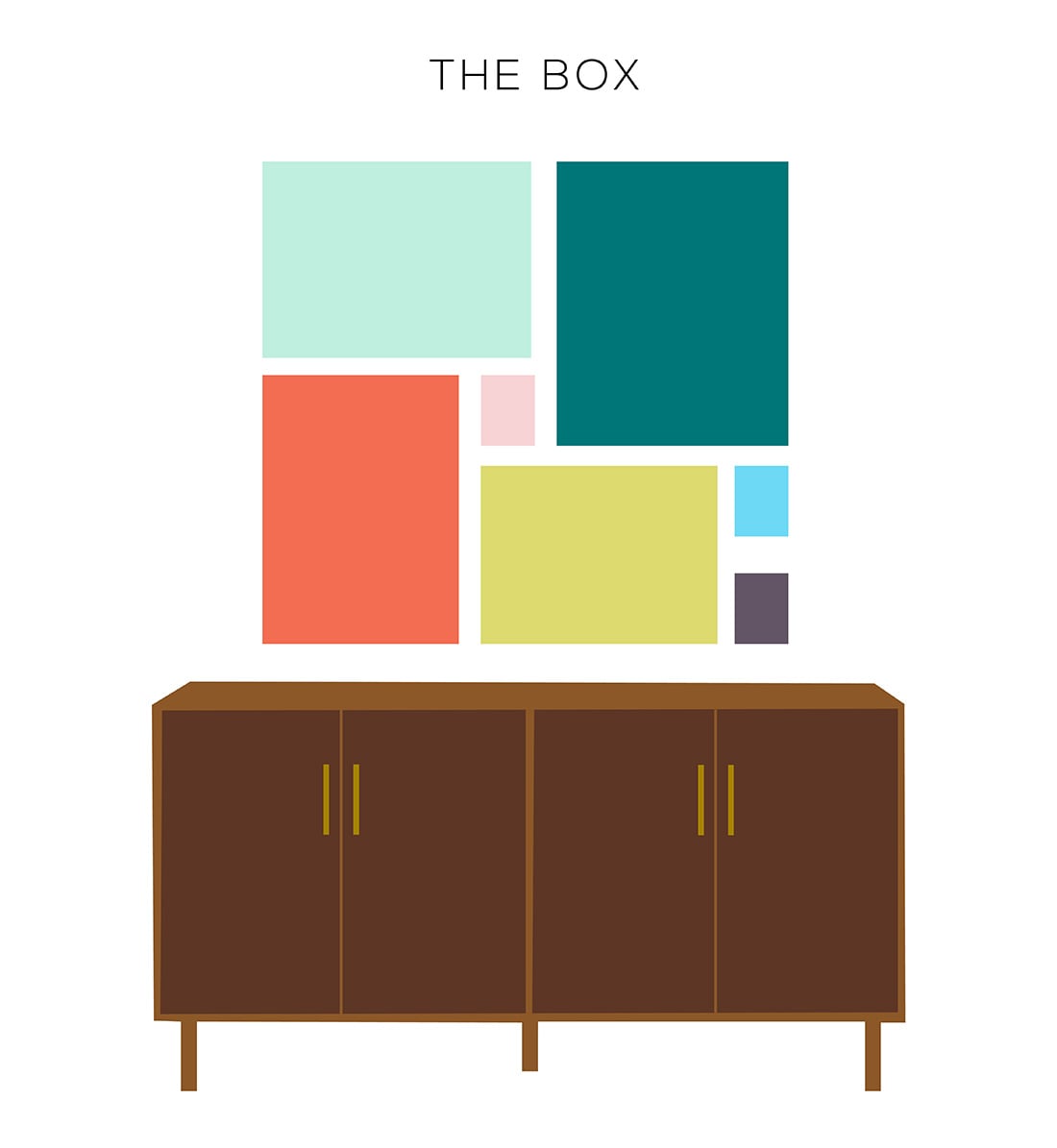
This gallery wall layout is not for the weak of heart. You’re gonna have to have some patience, friend, because you’re going to measure out several different shapes into a perfect box.
You know what, though? It’s going to look really nice when it’s done.
I would start with the biggest piece of art, put it in top righthand corner, then build the rest of the box around it.
I highly suggest planning this one out on the floor before putting any nails in the wall.
Works best with: a cohesive collection, family photos in black & white, one frame color
Try it in the: entry way, foyer, formal dining room, hallway
GALLERY WALL LAYOUTS: THE CLIMB
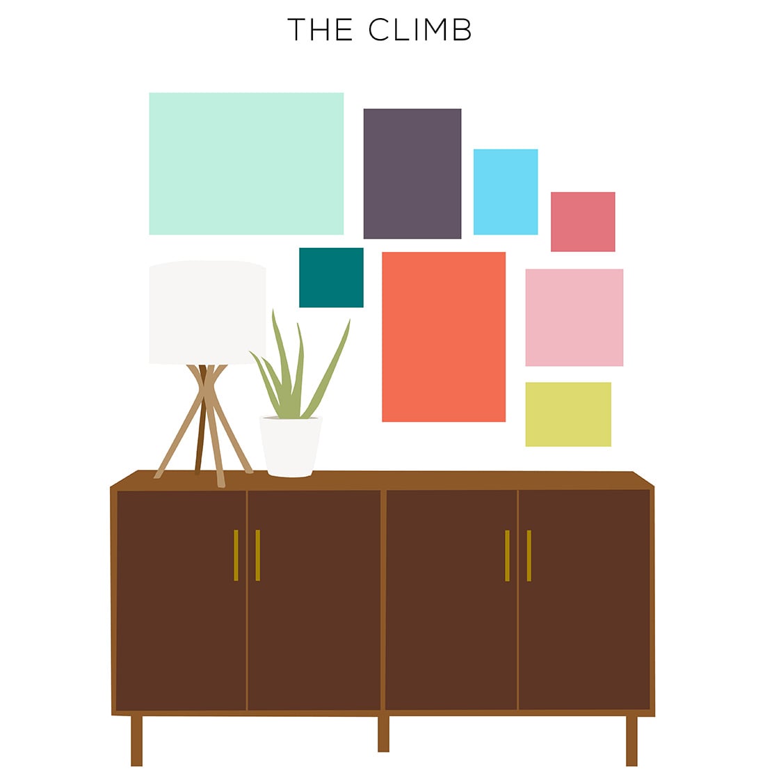
The best way to think of this gallery wall layout is that the bottom should resemble staggering steps … like a stairwell, which is typically where this design looks best.
You can also attempt it around furniture of varying lengths, or above a credenza that has a lamp and plant on it (as seen above).
Works best with: variety of art, variety of frames, mismatched art, a growing gallery wall (you can keep adding to this).
GALLERY WALL LAYOUTS: THE CROWN
Welcome to gallery wall layouts, youngling!
This is how you get your feet wet. It’s easy, not intimidating — but if played right, you can make a big impact with this layout.
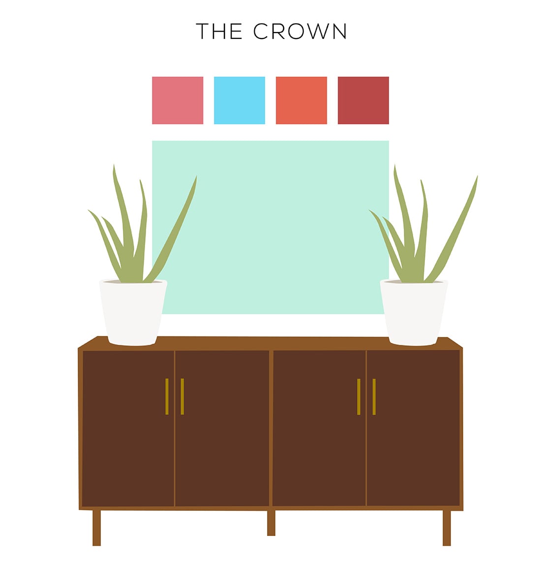
You’ll need one extra large piece of art, and several smaller pieces that you hang above like diamonds in a crown. I suggest matching frames. Gold if you’re fancy.
This layout is nice for showcasing a painting that you don’t plan on swapping out, plus 3-5 smaller pieces of art that can be seasonal or whimsical and swapped out often.
Works best with: one frame color, one anchor piece + 3-5 transitional pieces
Try it in the: entry way, foyer, living room, children’s rooms, bedrooms
GALLERY WALL LAYOUTS: THE ECLECTIC
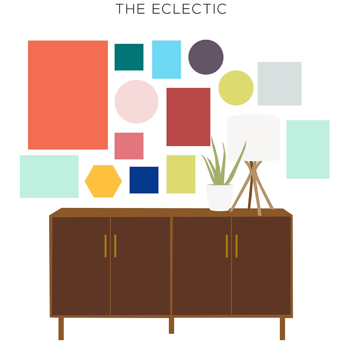
Depending on your personality, you’re either looking at this one like “YAY” or you’re breaking out in hives at the thought of it.
If you’re saying, “YAY,” then grab all your shapes, all your frames, all your art, and get to it.
Definitely plan it out on the floor first, and leave a couple of inches of space between each frame to let the gallery wall breathe.
Works best with: variety of art, variety of frames, variety of shapes, mismatched art, a growing gallery wall (you can keep adding to this), floor-to-ceiling gallery walls
Try it in the: living room, hallway, a large feature wall
GALLERY WALL LAYOUTS: THE GRID
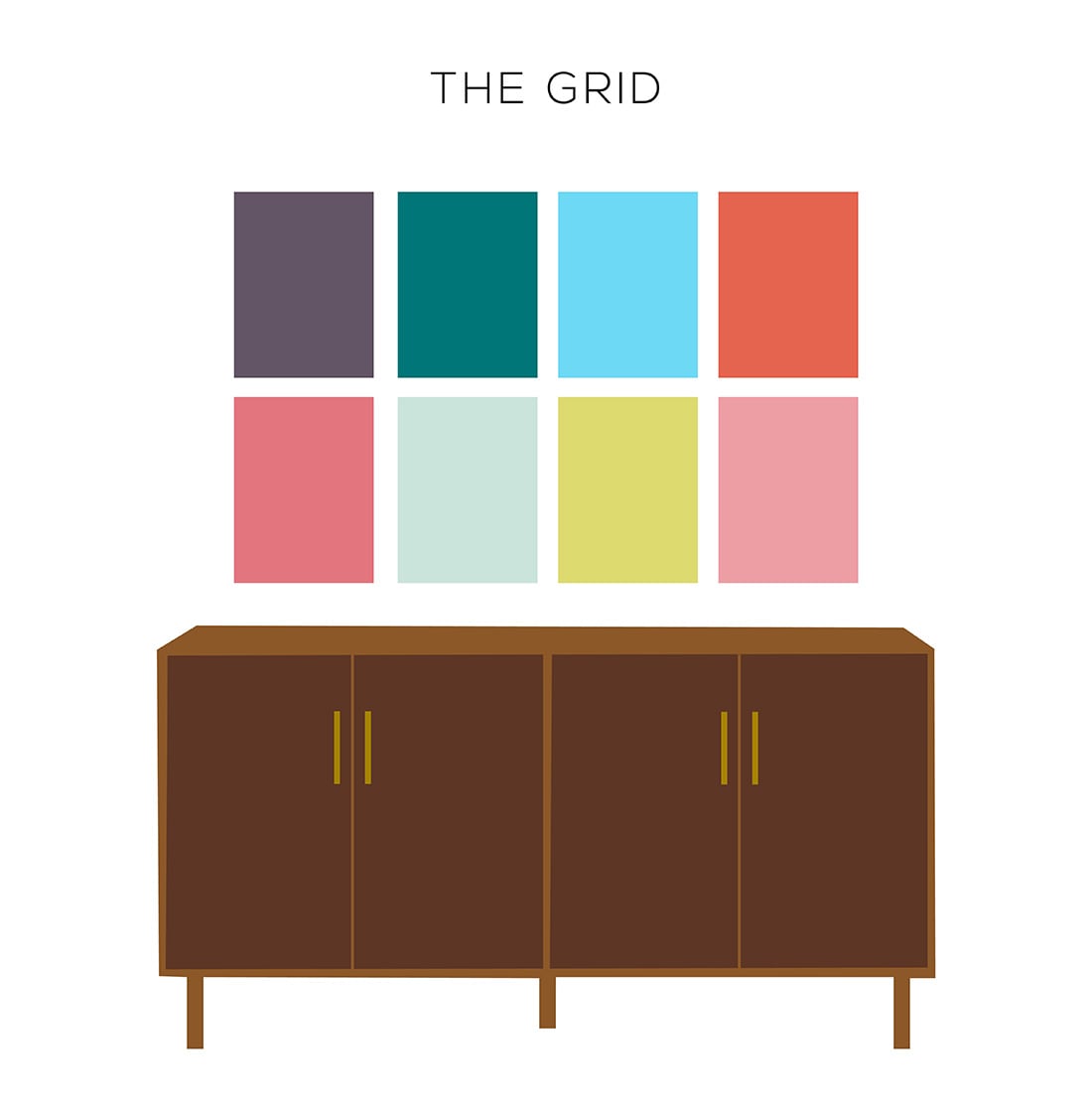
If The Eclectic gave you hives, you might be more into The Grid.
My favorite way to use the grid is with family photos, either all color or all black & white.
It’s an easy way to make a family photo collection look cohesive, especially if you use a mix of vintage and new images.
Works best with: one frame color, family photos, concert posters, album covers
Try it in the: living room, hallway, den
GALLERY WALL LAYOUTS: THE LEAN
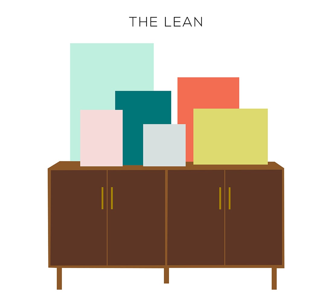
I’ve been into The Lean lately. If you’re noncommittal about your art, this might be the best place to start.
Just frame it, lean it, and admire it.
You can lean your art on a credenza or shelves on the wall, but be careful of placement if you’re in earthquake country.
Works best with: variety of frames, variety of art, variety of sizes, seasonal or transitional art
Try it in the: living room, hallway, children’s rooms
GALLERY WALL LAYOUTS: THE MIRROR
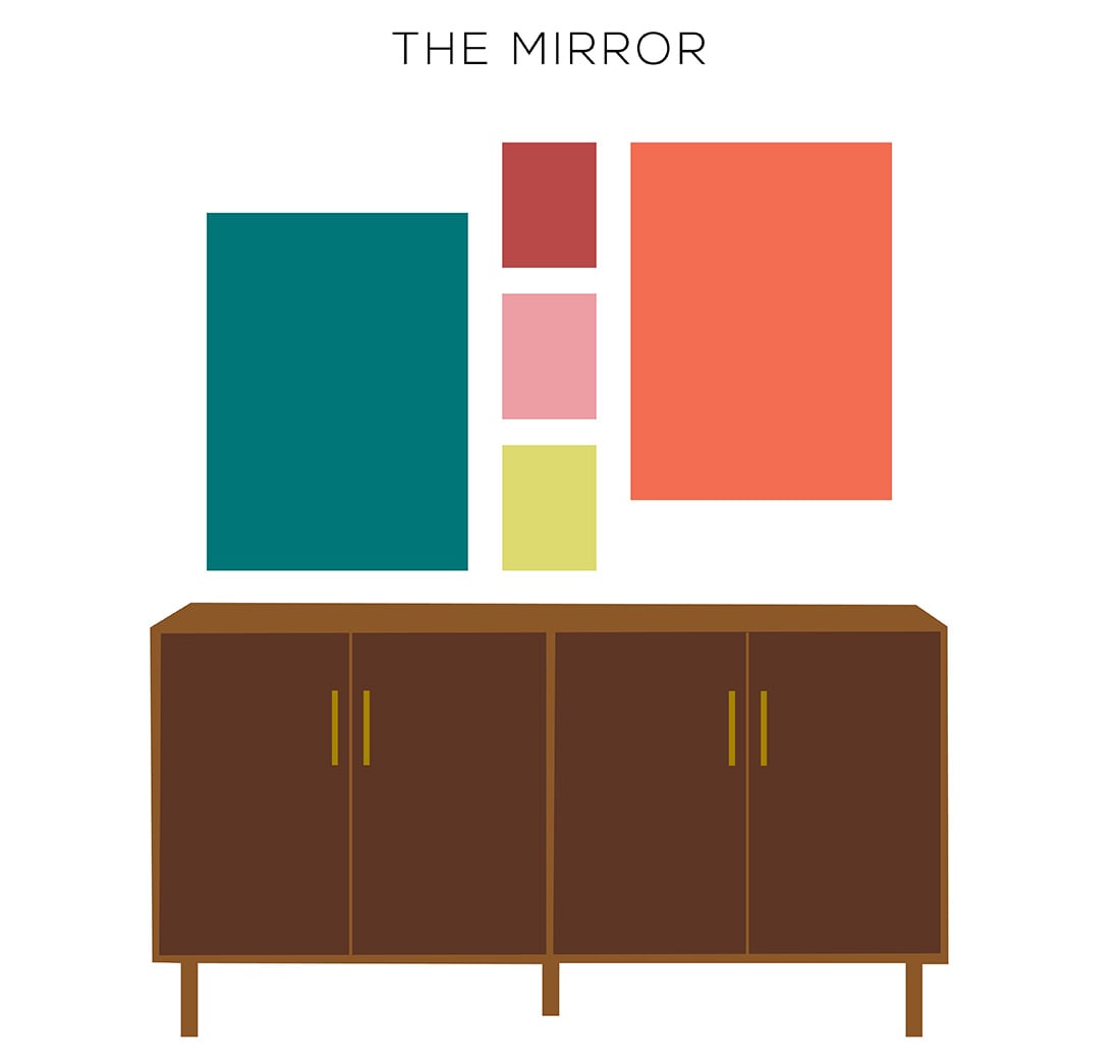
Here’s a little more of an avant-garde, asymmetrical layout for you.
I like to run a line of smaller art up the middle, then mimic mirror image shapes on either side.
Works best with: one frame color, artwork such as paintings
Try it in the: formal living room or dining room, above a bedroom dresser
GALLERY WALL LAYOUTS: THE ORGANIC

Otherwise known as the gallery wall classic!
You start with one big piece of dominant art. Then you bring in smaller pieces and wrap them around as you see fit. Leave a uniform space in between frames to keep it cohesive.
This is the best layout for incomplete gallery walls. You can always add another frame to the outside!
Works best with: variety of frames, variety of sizes, mismatched art, a growing gallery wall (you can keep adding to this)
Try it in the: living room, hallway, den, above the sofa, above credenzas, dining rooms, bathrooms, bedrooms … any room
GALLERY WALL LAYOUTS: THE PYRAMID
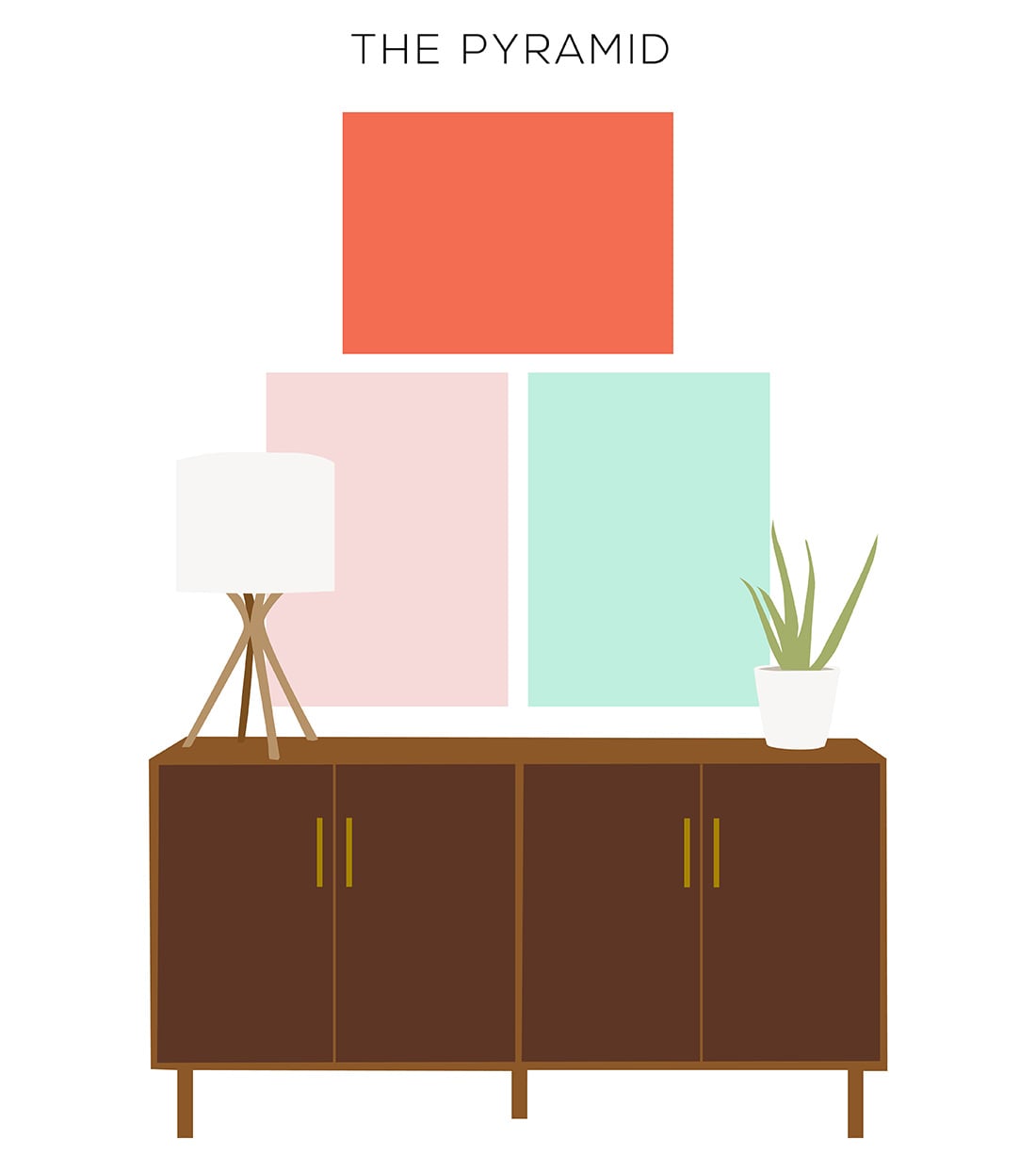
Another gallery wall lite, friends.
The Pyramid layout is best for a tiny collection of similar art or photos from the same photoshoot.
Works best with: one frame color, cohesive collection of art
Try it in the: bedroom, formal living or dining room, foyer
GALLERY WALL LAYOUTS: THE SPIRAL
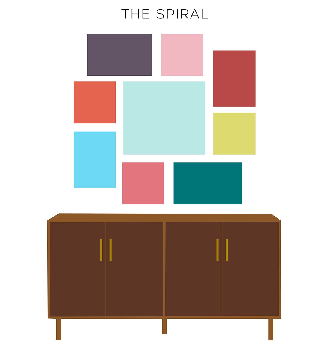
The Spiral is like The Organic, but more organized.
You’re literally going to take one piece of focal art, then wrap all your other art around it in a circle.
If you look at the image above, you’ll see that I’ve used eight frames of two different sizes to wrap around the center image. Spaced apart just right, this frame size symmetry will make your spiral appear controlled.
You do not have to be so regimented, but just keep in mind your spiral will be less symmetrical if you use a variety of frame sizes.
Works best with: one frame color, 2-3 frame sizes total, variety of art
Try it in the: kids’ bedrooms, living room, hallway, large open walls so you can use large frame sizes
GALLERY WALL LAYOUTS: THE STACKS
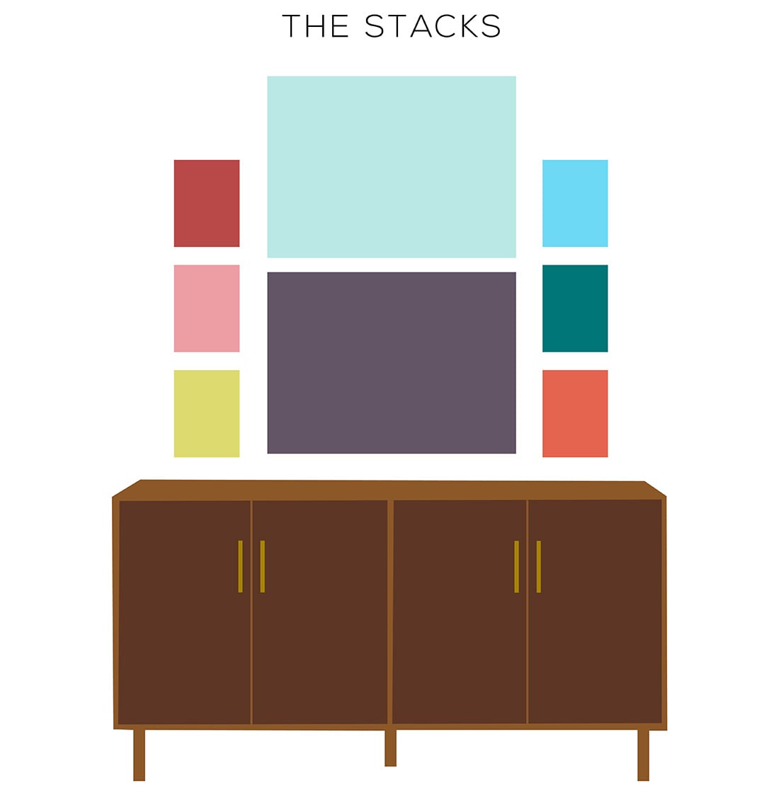
Guys, if you love Tetris, you’ll love this one.
The only way The Stacks looks good and not crazy is if you limit it to three uneven columns.
Works best with: 1-2 frame colors, variety of art, identical frame sizes for each stack
Try it in the: entryway or foyer, above sofa, living room, dining room
GALLERY WALL LAYOUTS: THE TRIPTYCH
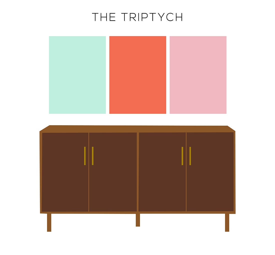
If you thought The Crown and The Pyramid were awesomely easy, you’re really going to love this one.
The Triptych is a classic above-the-bed move, and it works especially well for three cohesive pieces of art.
Works best with: one frame color, cohesive collection of art
Try it in the: bedroom over the bed, formal living or dining room, foyer
GALLERY WALL LAYOUTS: THE WATERFALL
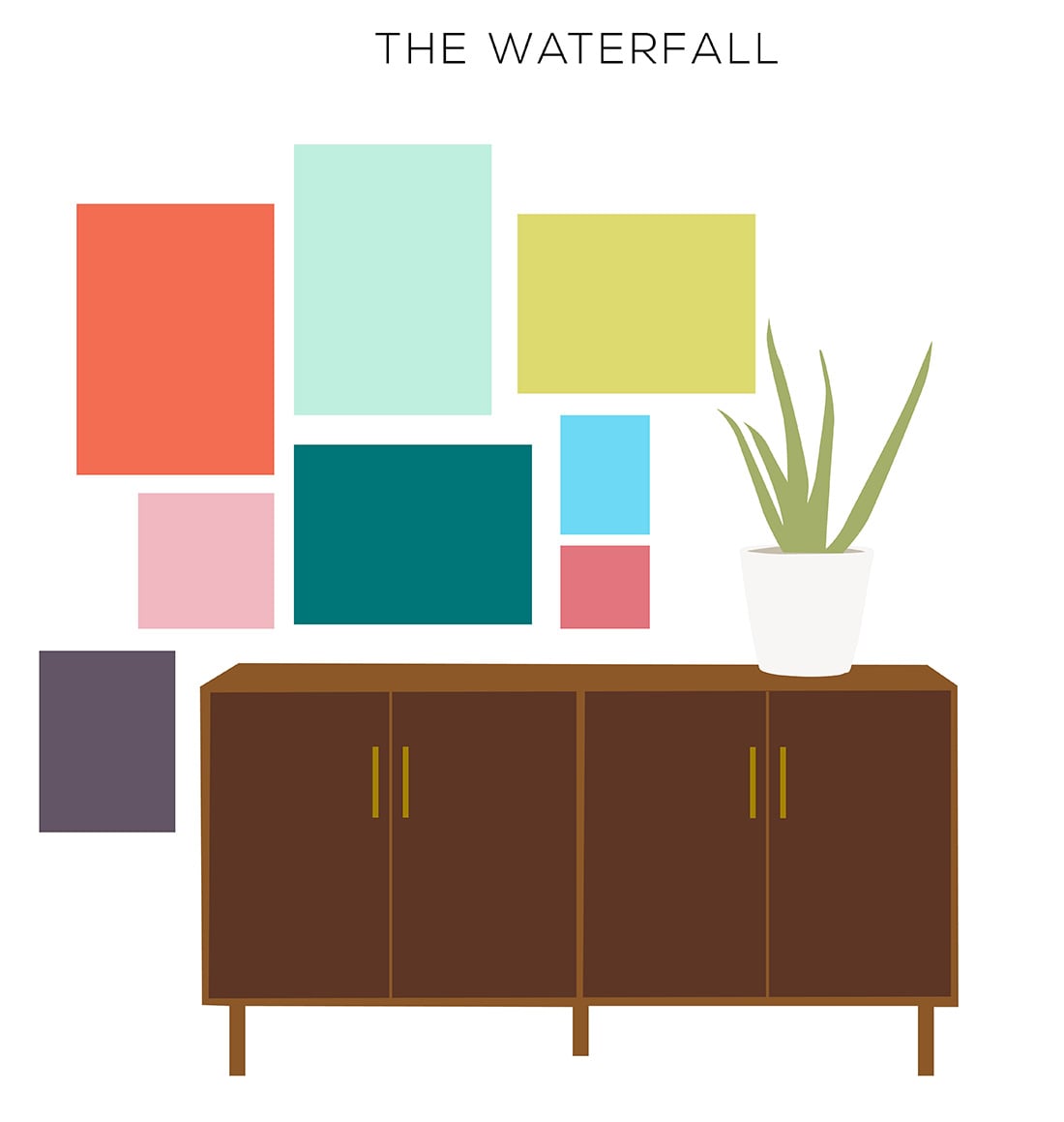
Let’s get asymmetrical, shall we?
Generally, you center a gallery wall over a piece of furniture. This time we’re going to break the rules and start it slightly off-kilter. Then you’re going to let the art hang down off the side.
Like a waterfall!
Break all the rules with this one. Have fun!
Works best with: variety of frames, variety of sizes, mismatched art
Try it in the: informal, quirky spaces
