Home Decor
3 Reason Your Gallery Wall Isn’t Working (and How to Fix It)

Problem #1: Your artwork is hung too close together.
The first mistake I see people making with gallery walls is that they’re placing the elements of their display too close together.
I’m talking about leaving only a few inches in between everything you’re hanging — which often means that you’re leaving far too much of the wall still empty.
And isn’t that why you’re creating a gallery wall in the first place? To create a focal point and fill a large space?
Don’t skimp on the artwork, guys. If you have too few pieces, your art collection is going to look like a small blip on a giant wall, and it’s not going to be the focal point that you’d hoped.
I know what you’re thinking, though…..but Kate, it takes time to collect the perfect pieces. Am I supposed to just deal with this huge blank space for even LONGER even though I already have some of the artwork I’ll be using already?
I totally get it, not to mention I am horribly impatient.
When I decorate, I want all the perfect pieces right now, and I hate thinking about leaving a decorating project in view that feels even the slightest bit undone. Or worse yet, putting off hanging up my artwork when I already have 90% of what I need.
So one trick I use when I am just dying to hang up art but don’t have all the perfect pieces yet is to buy a blank frame in the desired size that will help round out my gallery wall, and hang it up.
And yes….I leave it blank. I’ve learned to live with this compromise. Better to have that placeholder there and add THE print when the mood strikes than to try making do with an incomplete collection.
After all, good decorating takes time.
And when I’ve rushed decorating in the past, I’ve always been disappointed in the results. So it’s best to (try to) be patient.
As for finding the correct layout and spacing, the best way to make sure you’re filling the wall adequately is to lay all your artwork on the floor before hanging it, and move the pieces around until you’re happy with the result.
This technique helps you get your spacing correct without putting unnecessary extra holes in your walls.
Problem #2: You have too many elements that are the same exact size.
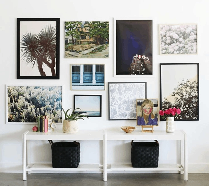
Unless you are aiming for clean and crisp uniformity — which can be absolutely beautiful— you need to vary the sizes of the elements you’re including in your gallery wall.
When you vary the sizes of the prints you’re using, your eye more easily shifts from one print to the next, allowing you to take in the entire gallery wall. When you use several prints that are all the same size, your eyes don’t know where to look first.
And don’t forget to use prints in both vertical and horizontal orientations.
When it comes to artwork collections, variety really is the spice of life — embrace it!

And one more thing: Don’t hang prints on the wall that have a frame size smaller than 8×10.
Art prints or photos that are too small get lost in a wall display.
Save those smaller prints for your nightstand or your family room console table.
Problem #3: Something in your gallery wall was purchased at Bed, Bath & Beyond.
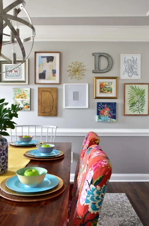
No disrespect to Bed, Bath & Beyond — I happen to have purchased many a fabulous pair of sheets there and some nice cookware over the years — but the artwork in your gallery wall should be unique to you and tell your story. Not the story of a big box retailer.
Now, if you just love a piece of art, buy it. No matter where it’s from.
But the thing I try to avoid is walking into a store in search of a “filler” art piece because I need one final thing to add to my wall.
I’ve made that mistake before, and I’ve always regretted it.
On a related note, I typically try to abide by these guidelines:
- Keep quotes to a minimum (Use words on walls sparingly)
- No reprints of famous art pieces
- Steer clear of anything that looks overly mass produced

Have you experienced any other challenges when creating a gallery wall?
What other parts of the process do you find most difficult? Tell me below!
